
I plan to add conditional rendering based on the state and update the App to reflect it. Make sure you are familiar with concepts related to React state Hook and props.
The job at hand is to entirely hide the form on the screen and have it only appear when the button is clicked and a new user submission is desired.
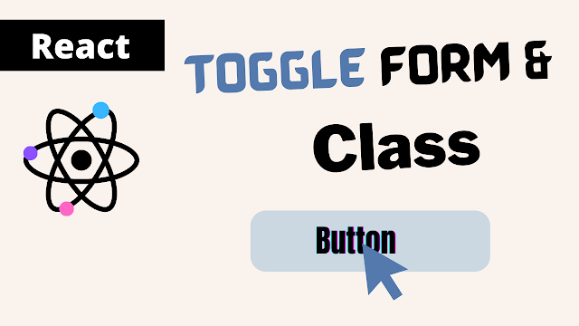
I've already shown how conditional rendering works in React; today I'll use one of the examples to show how conditional logic is applied to forms.
Display Form on Button Click
We have the UserForm inside the App component and have already created and worked with a form submission, I will apply all the logic inside the App file.
The addForm state variable and the state updating function setAddForm must first be registered in order to update the initial value of the useState() function, which by default returns the boolean value false.
const [addForm, setAddForm] = useState(false)The form is dependent on the state; if it is false, it will not appear on the screen.
Now, in JSX, I'll add a condition using the javascript expression && to the UserForm component, and it will check the value of the addForm variable, and if it is false, it will not output the form.
function App() {
  const [addForm, setAddForm] = useState(false)
  return (
    <div className="App">
      {addForm && <UserForm onAddDetail={addDetailHandler} />}
      <MyComponent />
    </div>
  );
}

export default App;
However, if I set the initial value to true, the form will be output on the screen and the expression will be evaluated.
const [addForm, setAddForm] = useState(true)What I'm looking for here is a toggle behavior when the button is pressed.
In the App component function, I'm going to declare the function displayForm, which will call the setAddForm function and update the default value.
I'm not going to specify the value manually, but instead set the value of variable addForm to the opposite value, which means that if the state value is false, it'll be true, but if it's true, it'll be false.
function App() {
  const [addForm, setAddForm] = useState(false)

  const displayForm = () => {
    setAddForm(!addForm)
  }
  return (
    <div className="App">
      {addForm && <UserForm onAddDetail={addDetailHandler} />}
      <MyComponent />
    </div>
  );
}

export default App;
Now we need to trigger that function if the user clicks the button, which happens to be inside the MyComponent file, so go to the JSX MyComponent element and pass the onAddForm and point to the function displayForm().
function App() {
  const [addForm, setAddForm] = useState(false)

  const displayForm = () => {
    setAddForm(!addForm)
  }
  return (
    <div className="App">
      {addForm && <UserForm onAddDetail={addDetailHandler} />}
      <MyComponent onAddForm={displayForm} />
    </div>
  );
}

export default App;
We have a button element inside of the MyComponent; we will listen for the onClick event and apply the props as a value to that element.
function MyComponent = (props) => {
  const className = props.active ? 'default' : 'active'

  return (
    <FancyBorder className="container">
      <button value='Happy coding' className={`${className} shape`} onClick={props.onAddForm}>Add List</button>
      {props.children}
    </FancyBorder>
  );
}

export default App;
If I click the button, the form will toggle exactly like that. Now that it toggles between, I want to dynamically alter the button color.
Change class name on click
I want to apply for a class based on conditions at this point. Using CSS styling, I'll modify the button's color based on its current state.
We have java script code in our MyComponent file that uses ternary operators to target various style props so that you may classify this button as active or default based on the condition. I've already described how to conditionally add a class to a React style.
const className = props.active ? 'default' : 'active'The StylesComponent.css file contains the CSS style that we have stored.
.active {
    background: steelblue;
}
.default {
    background: #d1d1d1;
}
We can now manage some extra state in the App component that will store the boolean false and update the value accordingly.
const [active, setActive] = useState('false')I will now pass this state updating method within the displayForm() function along with the argument active, which will operate in the opposite direction as the state stored value.
const displayForm = () => {
  setAddForm(!addForm)
  setActive(!active)
}
As the last step, we must pass the state variable as a value and the JSX property active to the MyComponent element.
<MyComponent onClick={displayForm} active={active} />When the button toggles, it will dynamically modify the button's style.
Conclusion
This section showed us how to dynamically apply a classname based on state hook, modify the background color, and show and hide functional components or forms with state updates on button clicks.


0 Comments:
Post a Comment