

Border appeals so much in web - around picture, content and layout, but you don't always have to use simple border you can take one step further and use images as a border around the HTML element.
For this we use border-image property.
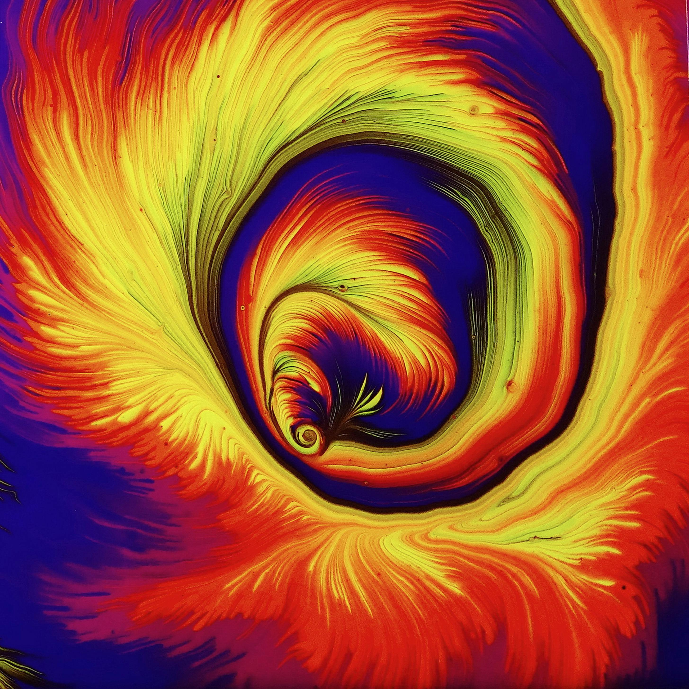
Suppose we want to use the above image as a border around our content.
Lets use border-image's properties.
border-image : border-image-source border-image-slice / border-image-width / border-image-outset border-image-repeat
border-image-source:
With this property, we can define the image path or URL.
border-image-source : url(fiona-art.jpg);Inside url() replaces image path with yours.
CSS gradient, inline SVG or data URI can also specified there.
border-image-slice:
Now use border-image-slice property like a knife and cut the source image in 4 rows and divide it into 9 sections, like a frame.

So we got four corners [1, 3, 9, 7], four sides [2, 6, 8, 4] and middle [5]. By initial, middle part is discarded, but by using "fill" you can set it as a background.
Lets slice 10% on each direction.

border-image-slice : 10%;border-image-width:
Now those slices render within the border image area, for example: if we provide 30px border-image-width, all the slices are scaled and represented in that width area.
Note: if border-image-width not provided, it takes the value of border-width.
Value can specify length (ex: px, em, rem ...), percentage(%), number and auto. Number multiplies by border-width and auto means image area is same as slices.
border-image-width : 10%; For surrounding content and border image to appear, we need to add border-width and border-style.
 border-width : 30px;
 border-style : solid;
Note: for shorthand 'border' property, please set it before the border-image-source. Ex-
border-image-source : url(fiona.jpg);
border-image-outset:
We can create space by pushing out border image from border box. Value can specify length and number, number multiply by Border-width.
Example -
border-image-outset : 2;border-image-repeat:
Remember, we divide the section into 9 parts, so the edges of the image will repeat and adjust to the size of image area.
Values for border-image-repeat -
stretch : The slices of image stretched to fill the space.
repeat : The slices of image repeat to fit in the area. Last repeated part could be clipped.
space : The slices of image repeated and put spaces in between.
border-image-repeat : stretch;
Note: you can specify maximum two values, one for vertical and second for horizontal.
Sort-hand property [border-image]:
border-image property is a shorthand property. We can provide all value in one line.
 border-image : url(fiona.jpg)   //border-image-source
     10% /   //border-image-slice
     10% /   //border-image-width
     1    //border-image-outset
     stretch;   //border-image-repeat


0 Comments:
Post a Comment